
Most scrub color guides are written by people who have never worn the same set at 4am, gone home, slept badly, and put it back on the next night.
That shows. They tell you what looks good in a product photo. They do not tell you which colors go grey under corridor lighting, which ones show every speck of lint by hour nine, or which fade to rust after six months of hot washes.
Night shift changes what matters. You are getting dressed when everyone else is winding down. You are looking at yourself in a locker room mirror under lights that flatter nothing. You are washing the same three sets on repeat because there is never a good moment to do laundry.
This roundup covers 17 scrub colors trending in 2026, from soft mauve and jade through to marigold and terracotta. Every one includes what it actually looks like on shift rather than on a model.
Mixed in you will also find the practical parts. How different colors fade over a year, how to test a shade under ward lighting before you commit, and how to buy so everything works together.
1. Dusty Mauve Is the Soft Neutral Doing Real Work
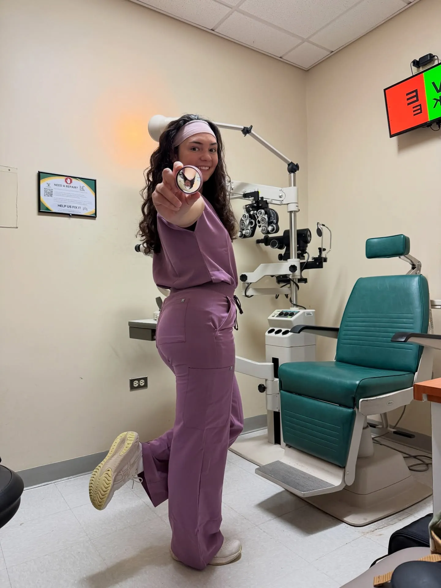
Mauve sits in a strange, useful spot. It reads warmer than grey and calmer than pink, which is why it turns up on nurses who want colour without announcing it.
The set here pairs a wrap-style top with wide-leg pants and a matching soft headband, styled with cream sneakers. That white shoe choice matters more than it looks.
- Cream and off-white keep mauve looking intentional
- Black shoes flatten it and pull the whole set grey
- A tonal headband makes the outfit read as planned instead of assembled
Mauve hides light marks better than pastels but shows dark stains clearly. It suits clinic and outpatient work more comfortably than a heavy med-surg floor.
💡 Quick Tip
Buy the top and pants in one order from the same brand. Mauve shifts noticeably between labels, and two slightly different mauves look like a mistake rather than a choice.
2. Deep Forest Green Reads Serious Without Reading Cold
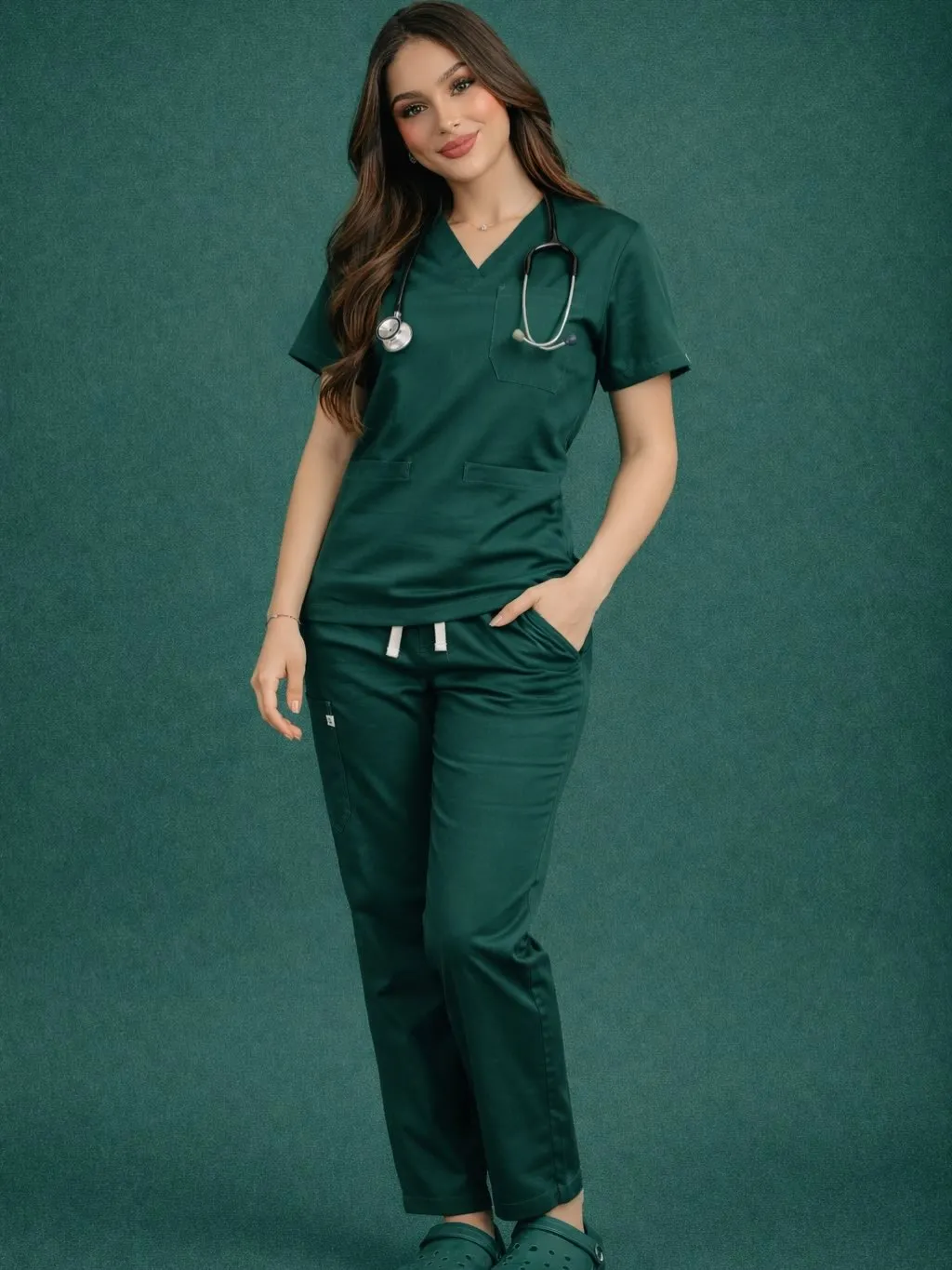
Forest green has quietly replaced a lot of navy over the last two years. It carries the same weight but feels less institutional.
This is a straightforward classic cut, V-neck top with a chest pocket, straight-leg pants with a drawstring, finished with matching green clogs. Nothing complicated, and that is the appeal.
Dark greens fade toward brown after enough hot washes. Cold water and inside-out drying buy you an extra season.
3. Bright Apple Green Is the One That Actually Wakes You Up
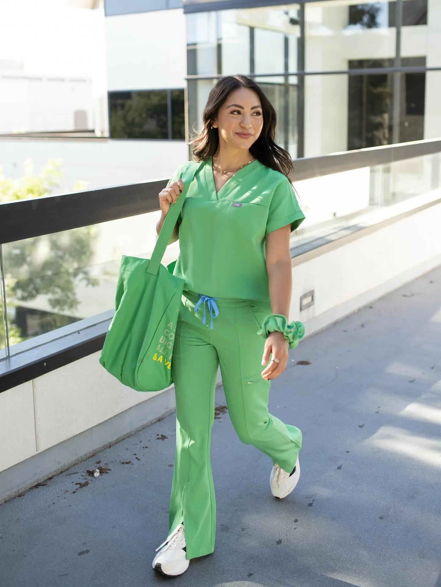
Most scrub colours are chosen to disappear. This one does the opposite.
The outfit is a full tonal green look, relaxed V-neck top tucked loosely, flared pants with a slight kick, matching tote and scrunchie. The detail that lifts it is the drawstring: a contrasting cornflower blue tie against all that green.
That single blue accent is what keeps the head-to-toe colour from feeling like a costume.
Making bright green work
Worth knowing: bright green shows everything. Save it for days you are not expecting mess.
4. Magenta Proves Pink Can Look Grown Up
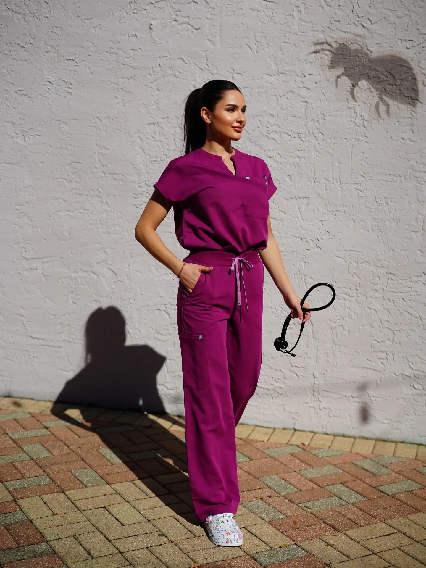
Soft pinks have a reputation problem in healthcare. Magenta solves it by going saturated instead of sweet.
Look at what makes this outfit work. The top is a mandarin-collar style with a notch opening rather than a standard V, gathered into an elastic waist. Straight wide pants below. The silhouette does as much as the colour.
Printed clogs pick up the pink without matching it exactly, which is a smarter move than a perfect match.
Pair with white, cream, or a printed shoe that echoes the tone.
Choose a structured neckline so the colour is not the only statement.
Matching a pale pink underscrub. It muddies both.
Grey shoes, which drain the warmth straight out.
5. Caribbean Teal Sits Between Blue and Green on Purpose
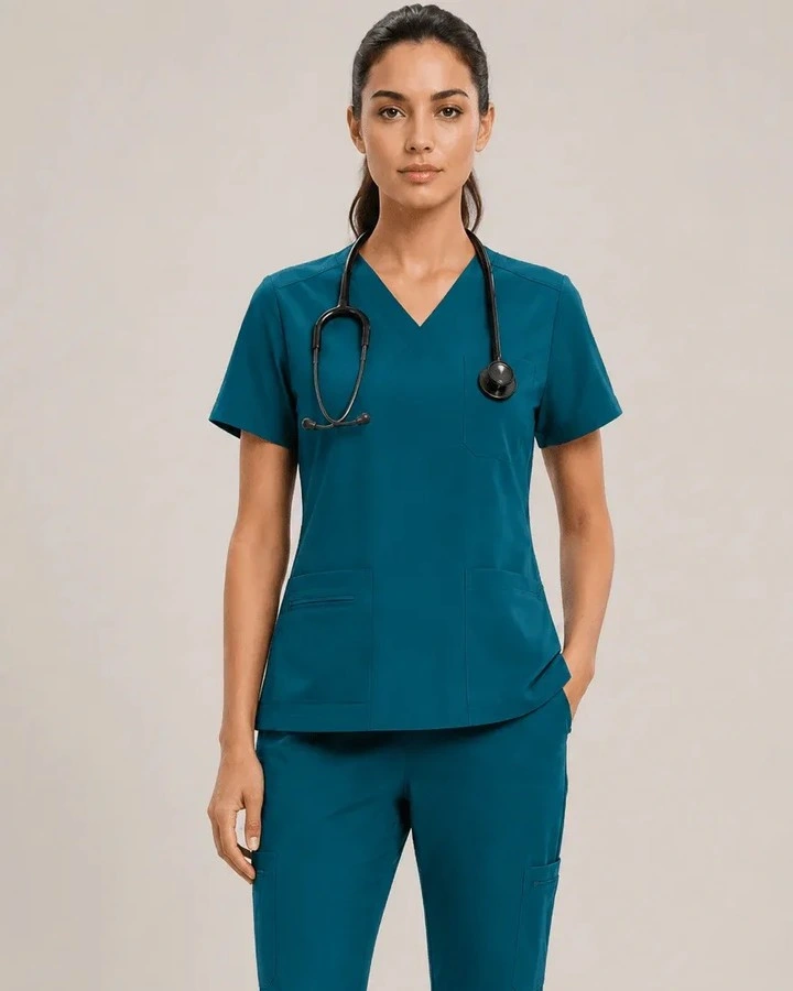
Neither fully blue nor fully green, teal hits a tone that flatters a wide range of skin tones without leaning cool or warm.
This one is styled simply: a fitted V-neck with double front pockets and a slightly curved hem, matching cargo-pocket pants, black stethoscope. Clean and unfussy.
The curved hem is a small design choice that stops the top from reading boxy when you reach across a bed.
Teal is the safest way to wear colour when your unit has no strict code. It looks deliberate on everyone and never looks like you tried too hard.
6. Marigold Orange Is the Colour Nobody Expects to Suit Them

Orange scares people off, usually because they picture safety-vest orange. This is not that.
The shade here is a warm golden marigold, worn as a full set with a plain V-neck top and matching pants. Then comes the part worth copying: a hot pink drawstring and a matching pink headband.
Two accents, same colour, placed at opposite ends of the outfit. That repetition is what makes it look styled rather than random.
Start with the full set in one warm shade, top and bottom matching.
Add one bright accent colour, then repeat it exactly once somewhere else.
Stop. A third accent turns the whole thing into noise.
7. Burgundy Is Navy’s Warm Replacement
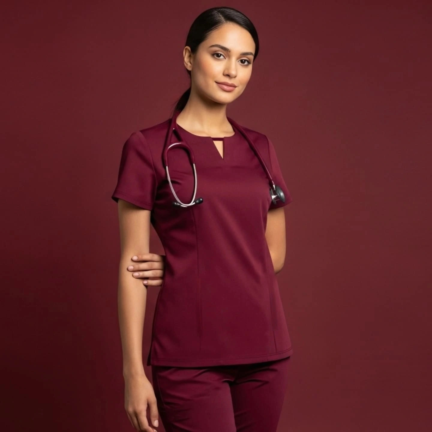
If navy feels tired but black feels severe, burgundy is the middle answer. It carries authority without the chill.
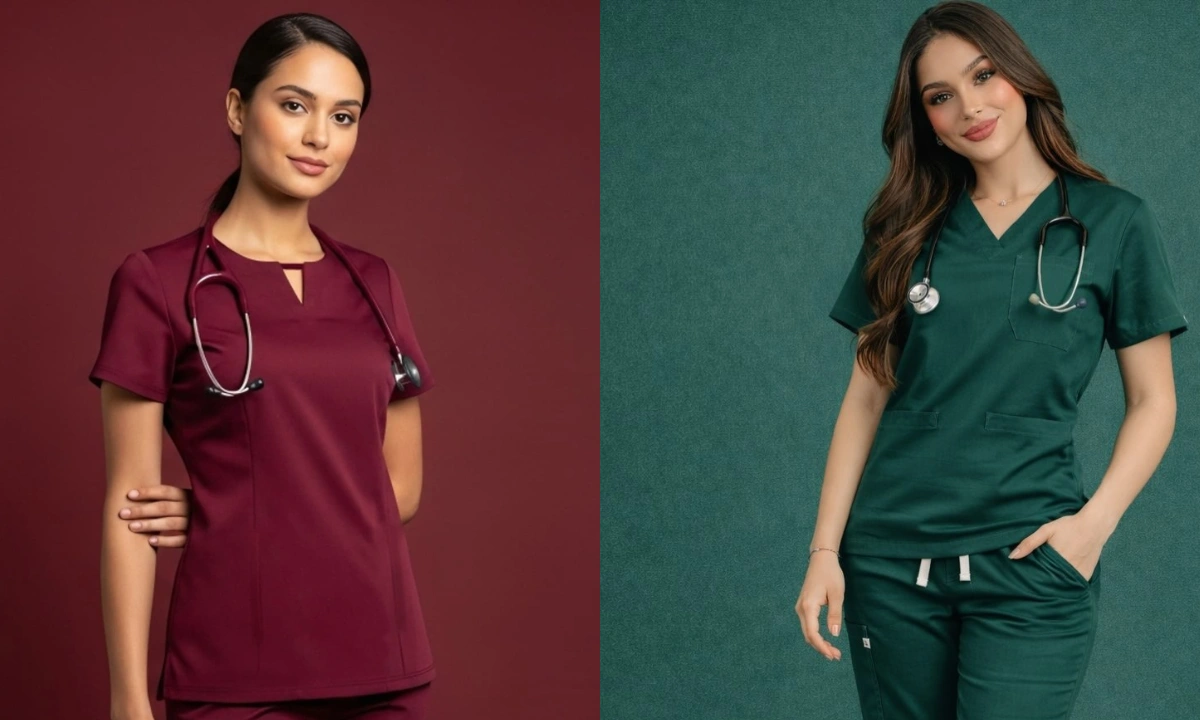
The top in this photo is worth noting on its own. A rounded collarless neckline with a small centre notch, princess seams running down the front, and a slightly longer hem. Tailoring details, not just a colour swap.
| Burgundy | Navy |
|---|---|
| Warm, softer against most skin tones | Cool, can look harsh under fluorescent light |
| Fewer people wear it, so you stand out slightly | Common enough to blend into any unit |
| Fades toward rust if washed hot | Fades toward grey, less obvious |
8. Navy With Gold Hardware Is a Different Colour Entirely

Same navy everyone owns. Completely different result.
The zip-front mock neck here has gold pulls at the collar and both chest pockets, worn with matching jogger-cuff pants and white platform sneakers. Nothing about the colour is new. The metal finish changes everything.
Silver hardware on navy reads clinical. Gold reads considered.Standard navy V-neck, silver snaps, straight-leg pants. Reads as the uniform you were issued.
Same navy, gold zip and pocket pulls, cuffed ankle, white sneaker. Reads as the uniform you chose.
A gold watch or thin gold chain repeats the metal and finishes it. Two pieces is plenty.
9. Jade Green Is the Softer Cousin of Surgical Teal

Traditional surgical green has decades of association behind it. Jade keeps the heritage but brightens it slightly, which reads friendlier in patient-facing roles.This one is a relaxed V-neck with a small chest pocket, matching pants with a pale mint drawstring. That lighter tie is the whole trick, a tonal contrast rather than a clashing one.
- ▸Tonal ties, a shade or two lighter, look softer than white ones.
- ▸Jade sits well with gold jewellery and warm-toned lanyards.
- ▸It is a common assigned colour, so check your code before committing to several sets.
10. Black Scrubs Look Sharp Until the Lint Arrives
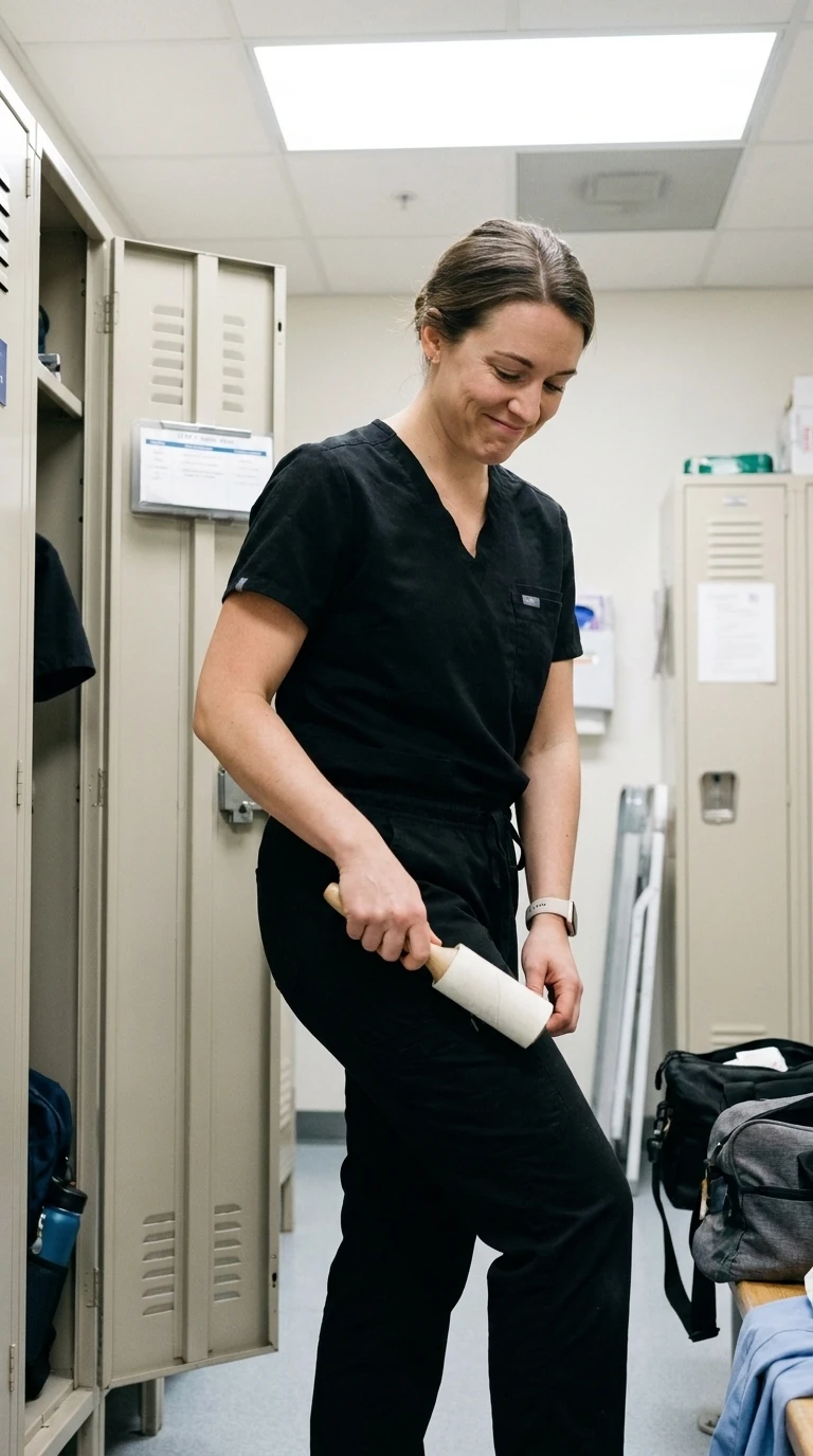
Black is having a real moment, and the reason is simple. It photographs well, it slims the silhouette, and it never clashes with anything.
The problem nobody mentions on Instagram: black shows lint, dust, hair, and dried soap residue more than any other colour. A black set can look immaculate at 7am and shabby by lunch.
⚠️ Watch Out
Wash black separately from towels and anything fleece. One shared load with a white towel and you will spend your shift picking at your own trousers.
A lint roller in your bag solves most of it. Keep one in the car too.
11. Your Unit Probably Already Chose Your Colour

Before you spend money on a shade you love, find out whether you are allowed to wear it.
Plenty of US hospitals assign colours by role so patients and families can identify staff at a glance. The system varies wildly between facilities, which is exactly why people get caught out.
Even where colours are assigned, the shade often is not. Two navies from different brands can look noticeably different, and that is usually where you get room to choose.
12. Slate Blue Is What People Buy When Navy Feels Too Dark

Somewhere between grey and blue sits the shade doing quiet numbers right now. Slate reads modern without the heaviness of navy or the flatness of plain grey.
It works particularly well if your unit allows blue but you are tired of everyone matching.
- ▸Sits comfortably under most colour code policies that specify blue.
- ▸Hides marks better than light grey, worse than navy.
- ▸Pairs cleanly with silver hardware and grey or white shoes.
One catch worth knowing: slate varies enormously by brand. Some lean genuinely blue, others are almost grey. Order one before committing.
13. What a Year of Washing Actually Does to Each Colour
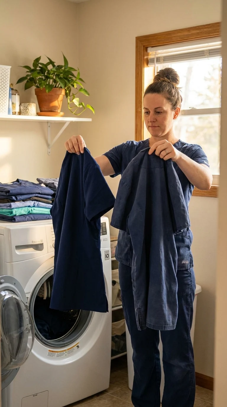
Every colour fades. They just fade differently, and knowing the direction helps you decide what to spend on.
| Colour family | Where it ends up |
|---|---|
| Black and charcoal | Dusty, slightly brown or green cast |
| Burgundy and wine | Rust or brick, quite visible |
| Navy and slate | Softer, greyer, fades gracefully |
| Bright and neon shades | Chalky, loses saturation fastest |
| Sage and muted tones | Barely noticeable, most forgiving |
If you rotate five sets rather than three, each one goes through fewer cycles and everything lasts longer. Buying more up front is often cheaper across a year.
14. Lavender Divides People, and Fluorescents Are the Reason

Lavender looks beautiful in daylight and in every product photo. Under hospital fluorescent lighting it can turn grey, ashy, or faintly clinical.
That is not the colour’s fault. It is a lighting problem, and it affects some shades far more than others.
Buy one set and wear it for a full shift before ordering more.
Take a photo of yourself in it under the ward lights, not at home.
If it looks grey in that photo, go warmer. A lavender with pink in it holds up better than one with blue.
The same test is worth running on any pastel before you buy a full rotation.
15. Terracotta Is the Colour Home Decor Sent to Work

Warm clay tones have taken over interiors, and scrubs are catching up. Terracotta reads earthy and grounded rather than corporate.
It behaves well on shift too. Dark enough to hide the small stuff, warm enough to flatter most skin tones, and rare enough that you will not match four colleagues.
Bone or tan sneakers suit it far better than stark white, which fights the warmth.
16. Pick the Colour That Suits You, Not the One That Is Trending

Trend lists are useful right up until they talk you into a shade that drains your face.
A rough guide that holds up better than most: notice whether silver or gold jewellery looks better on you. Silver usually means cooler colours sit well. Gold usually means warmer ones do.
Navy, slate, jade, true teal, charcoal.
Silver jewellery tends to look brighter on you than gold.
Terracotta, burgundy, marigold, olive, warm mauve.
Gold jewellery tends to look richer on you than silver.
Plenty of people sit in the middle and can wear both. If that is you, teal and burgundy are the two most forgiving places to start.
17. Buy Your Sets So Everything Mixes
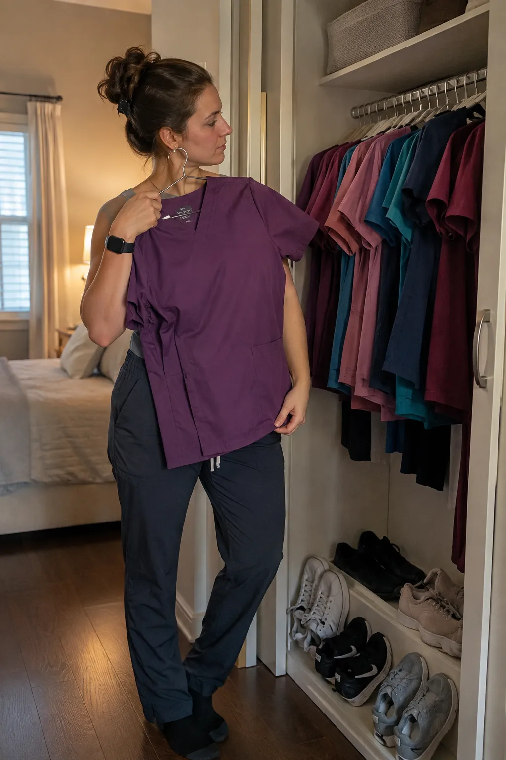
The fastest way to make a small collection feel bigger is to stop buying matched sets and start buying a system.
Three bottoms in dark neutrals, four tops in whatever colours you actually like. That gives you twelve combinations from seven pieces, and it means one stained top does not take a whole outfit out of rotation.
Bottoms take the most abuse and show the least colour. Spend your budget there on dark, durable neutrals, and let the tops carry whatever you feel like wearing that day.
One condition: buy all the bottoms from the same brand and line. Mixing brands means mixing blacks, and two slightly different blacks always look wrong together.
Which Color Should You Actually Buy?
The best scrub color is the one you still reach for on your fourth shift of the week. Trends are worth knowing, but comfort, your unit’s policy, and how a shade holds up after washing matter more than what is popular this season.
If you take one thing from this list, make it the mix-and-match approach. Dark bottoms, colored tops, everything working together. It stretches a small collection further than any single perfect set ever will.
Save the colors that caught your eye to your scrubs board so they are waiting when you are ready to order. Then come back and tell me which one you went with.
📌 Good To Know
Buy one set in a new color before buying three. Shades vary between brands, and a color that looked right on screen can read completely differently in person and under ward lighting.
